
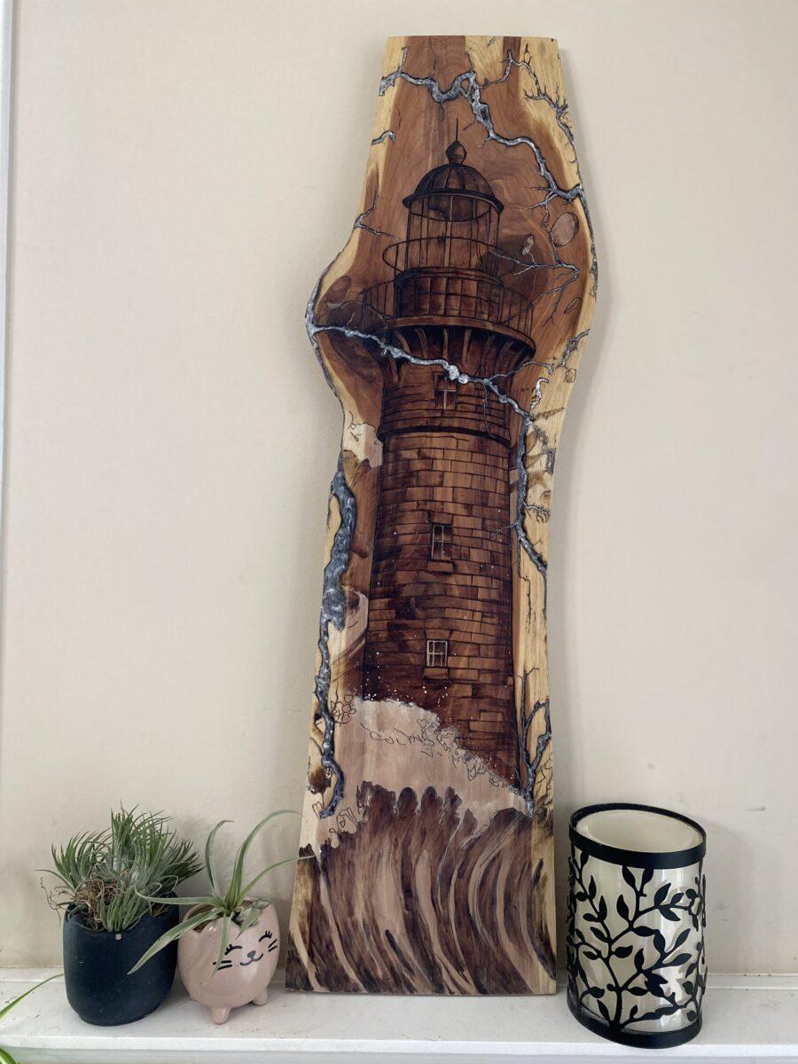
As a pyrographer, when creating a piece, there are many things to take into consideration. What type of wood, what size, and what feelings does it evoke. Often times I will look at a piece of wood and see what I want to burn into the surface right away. Take, for example, what happened when I looked at this piece of cedar that I received from Jessica of Crowley’s Crafty Creations. It is a tall, thin piece with fractals that remind me of lightning. I looked at it, and knew I wanted a lighthouse and, thus, The Beacon came to be.
The Wood
If you are making fine art, you should select a panel to match. A fine art panel is made of perfect wood that doesn’t have any knots, cracks, dips, or physical imperfections. Look for a canvas with clean, straight edges and sanded to buttery smoothness. For a pyrographer, the smoother the wood the easier it is to burn because the tip glides easily over the surface. You should also consider the species, and color of the wood, as well as the pattern (or lack of) in the wood. I prefer lighter-colored wood with less grain, like Clear Poplar. Choosing a pattern for a fine art panel can be easier because there are no imperfections to consider when choosing a pattern.
But a piece does not need to be fine art in order for it to be art. Art evokes emotions, art can be imperfect and messy. Wood is a natural medium, which means it has an intrinsic beauty that can make a beautiful canvas. Your canvas doesn’t need to be symmetrical, it may have live edge (loose bark still attached), holes, loose pieces, rotted parts, dark lines, and water damage that may make it unsuitable for fine art. Freshly milled wood can reveal knots, dips, bumps, and exciting imperfections. Consider the shape, and the interesting patterns in the grain. Sometimes a knot or a crack can be incorporated into your design.
It can feel like a little bit of a “chicken or egg” situation. Do you choose your design and find a piece of wood for your canvas, or do you pick a piece of wood and select your design.
Wood Color
In addition to the shape and pattern you should also consider the color of the wood itself. If your design requires light lines and shading a darker piece of wood is not a good choice. Shading will blend into the natural wood especially if you seal it. If the pattern requires thick, dark lines a darker piece of wood might be a better choice. Be careful, though, there is still a chance that it will blend into the wood.
I don’t prefer one of the other. Just like The Beacon, I saw the wood first and chose the pattern in my head. But I have also found patterns that I absolutely loved and searched for the perfect wood for it. Most artists I have spoken to use both methods in creating their pieces.
Wood Shape
You also need to consider the shape of the wood. When I look at a pattern I look at it as a whole as well as it’s individual parts. The composition of your piece may require certain parts to draws the eye of the viewer. The wood should accommodate these things. You can resize a pattern to suit the wood, but sometimes that’s not possible. The shape of the wood should suit the pattern and vice versa. It should not cut off important pieces of the pattern.
Sometimes the shape of the wood can inspire a scene. I saw an artist who used a crack in the wood in her art. She burned bees around the crack as if the bees were coming out of the crack. It was lovely. Another artist created an underwater scene with her canvas. You can get wood cut into shapes that would suit a pattern. I used wood shaped like a flying eagle to create a patriotic scene with the American flag, mountains, and wildlife.
To color or not to color the pattern
Some pyrographers do not color in their art, rather they use shading alone to color the piece. Some use texture such as stipling to create depth and interest. When I choose the wood and the pattern I think about whether I plan to use color and what color medium I want to use. Darker and medium woods need opaque mediums like acrylic or gouache in order to see them. Lighter-colored wood can accommodate most color mediums. Think about how the medium reacts with the wood. Watercolor paints are usually more translucent and you can see the wood grain through it; gouache and acrylic is opaque and can be used on most woods with very few layers; India ink is vibrant but can also be translucent; handmade watercolors can have mica and glitter that would sit on top of the wood while the color gets soaked into the wood (if you are using porous wood or end grain).
What are some of your tips for choosing the right wood? Tag us @bz_furfur and let us know and, as always, stay unique.